Product grid
How to customize your collection product & filtering section

Section settings
Page width
Boxed: With boxed width, page content can be displayed within the maximum width. The page width can be changed in Theme Settings > Layout.
Full width: With the "Full width" option, page content can be displayed in its entirety full-width. When you show content at full width, you can add padding to the left and right sides.
Products per page
You can change the "Products per page" limit from 8 to 100 maximum on the collection page
Number of columns on desktop
You can change the number of columns on desktop
Display one column on mobile
You can display one column on mobile. By default, 2 columns will be displayed
Enable layout switcher
You can enable/disable the product column switcher -

Filtering & sorting
Enable filtering

How to customize the filtering
Go to this page and follow the instructions -
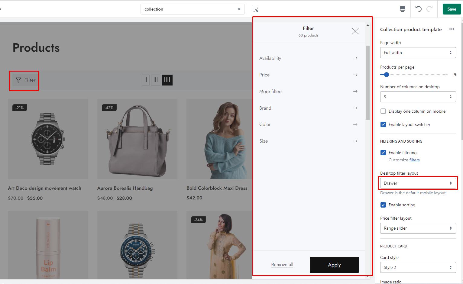
Desktop filter layout


Enable sorting

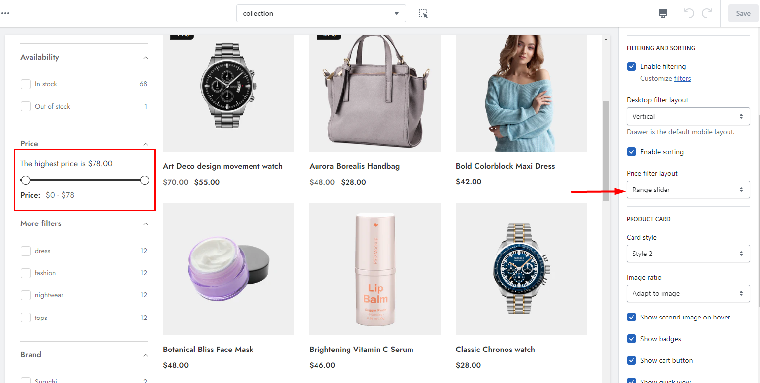
Price filter layout


Product card

Card style
Style 1: All action buttons will always be displayed if you select this
Style 2: All action buttons will appear on hover when you select it
Image ratio
Adapt to image: Uses the aspect ratio of the collection images is cropped.
Portrait: uses a 2:3 cropping ratio to the images.
Square: uses a 1:1 cropping ratio to the images.
Landscape: uses a 3:2 cropping ratio to the images.
Enable color swatches
To display color swatches, you need to enable it. [Learn more]
Show second image on hover
Shows the second product image when a customer moves their mouse over the first image.
Show badges
For particular sections, you can show or hide product badges.
Show cart button
For particular sections, you can show or hide the cart button.
Show pre-order button
You may want to allow customers to purchase out-of-stock items. [Learn more]
Show quick view
For particular sections, you can show or hide the quick view.
Show compare button
For particular sections, you can show or hide the compare button.
Show wishlist button
For particular sections, you can show or hide the wishlist button.
Show title
For particular sections, you can show or hide the title.
Show price
For particular sections, you can show or hide the wishlist price.
Show vendor
For particular sections, you can show or hide the wishlist vendor.
Show countdown
To display the countdown timer, you need to enable it. [Learn more]
Show product rating
To display the product rating, you need to enable it. [Learn more]
Section padding
Desktop: Padding top
The section’s top inner space height is determined. From 0 to 150 px, will be incremented by 5px. It will affect the desktop.
Desktop: Padding bottom
The section’s bottom inner space height is determined. From 0 to 150 px, will be incremented by 5px. It will affect the desktop.
Mobile: Padding top
The section’s top inner space height is determined. From 0 to 150 px, will be incremented by 5px. It will affect the mobile.
Mobile: Padding bottom
The section’s top inner space height is determined. From 0 to 150 px, will be incremented by 5px. It will affect the mobile.
Last updated