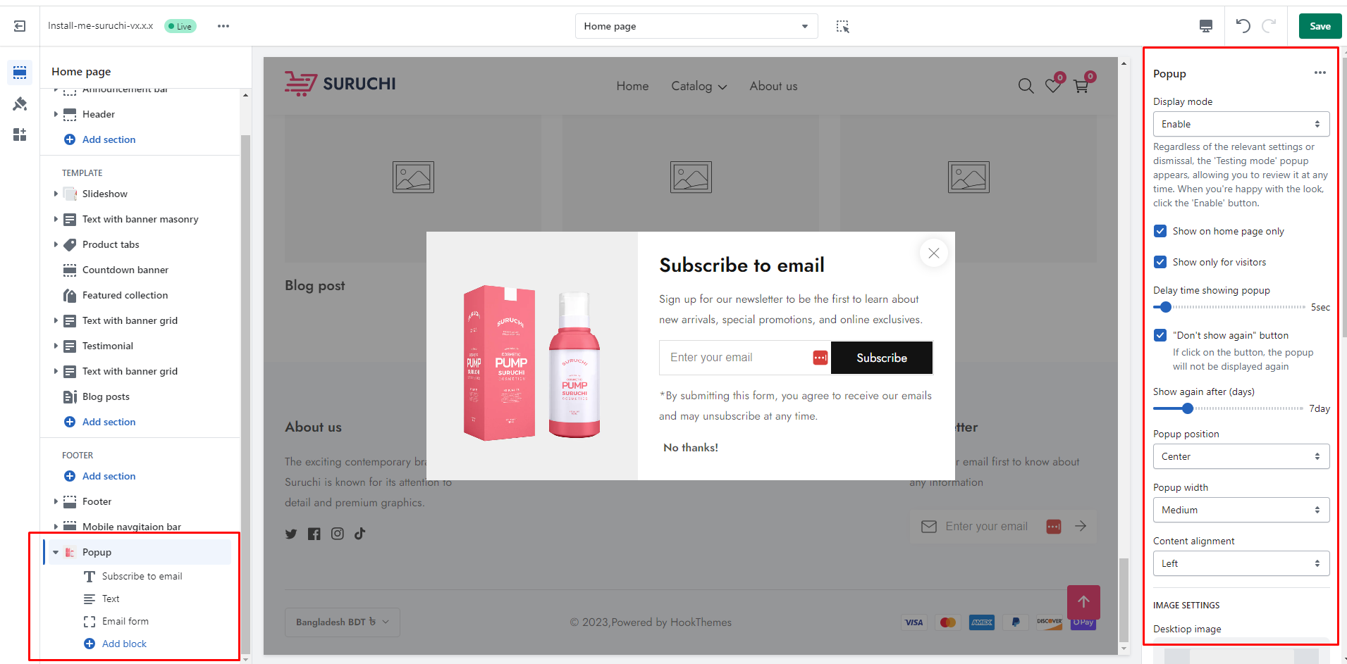
Enable: If you enable it. The popup will enable in your store.
Disable: If you disable it. The popup will be disabled in your store.
Testing: Regardless of the relevant settings or dismissal, the 'Testing mode' popup appears, allowing you to review it at any time. When you're happy with the look, click the 'Enable' button.
|
| **Show on home page only** | Allows for a popup only for the homepage. |
| **Show only for visitors** | If a customer registers in your store. The customer will not be shown this popup. The popup will only be visible to visitors. |
| **Delay time showing popup** | You can specify when the popup should appear after your website has loaded. The time span is 2 to 60 seconds. |
| **"Don't show again" button** | When a customer will get the popup for the first time. If the customer will click on this button, the popup will not be displayed again for the specific customer. |
| **Show again after (days)** | How long after clicking the **"Don't show again"** button will the customer see the popup again? |
| **Popup width** |
Small: This is the smallest width of the popup. Desktop width: 500px, Mobile width: 100% with a 50px offset
Medium (Default): If you disable it. The popup will be disabled in your store.
Large: This is the highest width of the popup. Desktop width: 1000px, Mobile width: 100% with a 50px offset
|
| **Content alignment** |
Left: Aligns the content to the left. Right: Aligns the content to the right. Center: Aligns the content to the center.
|
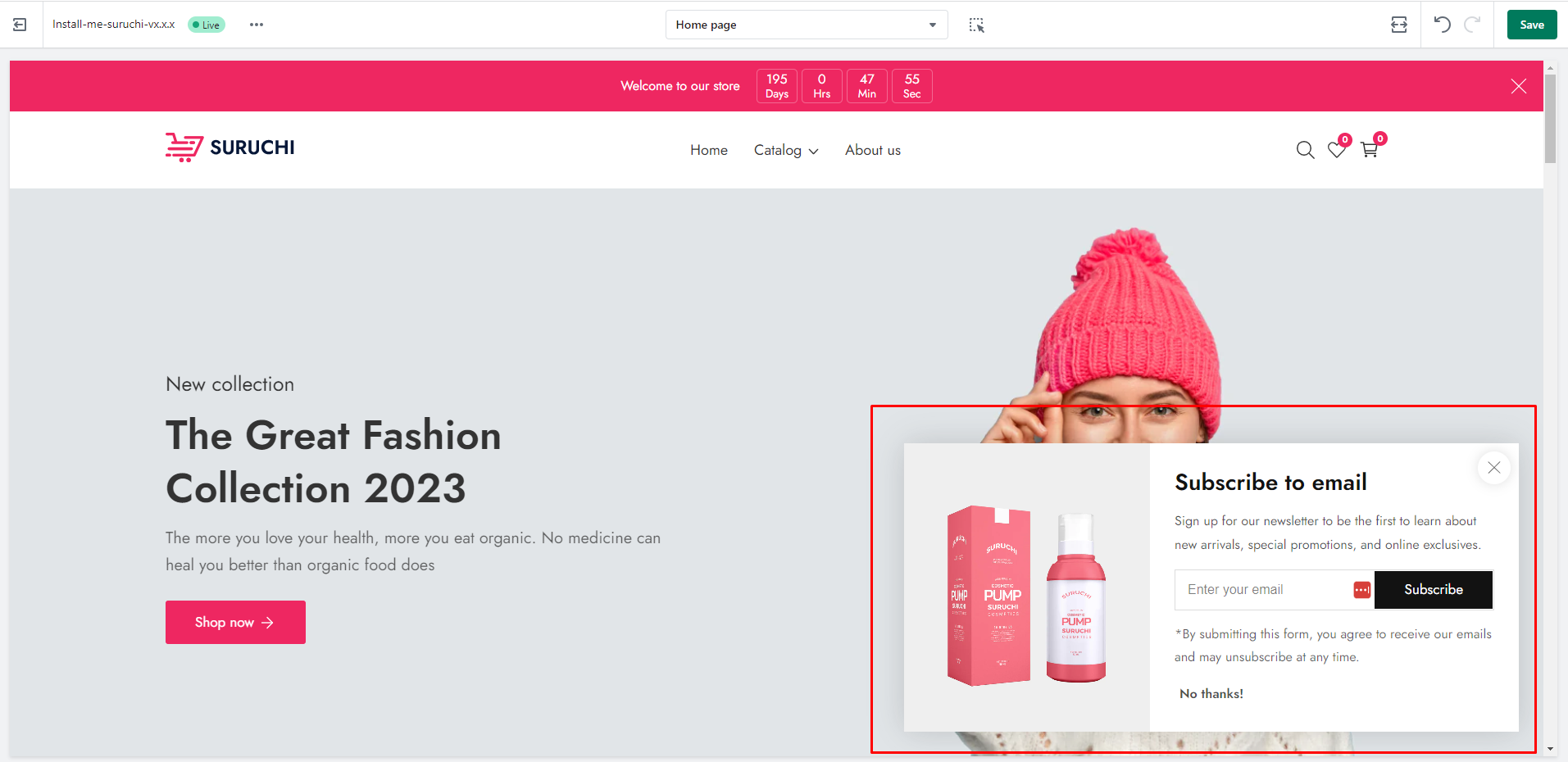
## **Popup position Settings**
{% tabs %}
{% tab title="Center" %}
{% endtab %}
{% tab title="Bottom right " %}
{% endtab %}
{% tab title="Bottom left" %}
{% endtab %}
{% endtabs %}
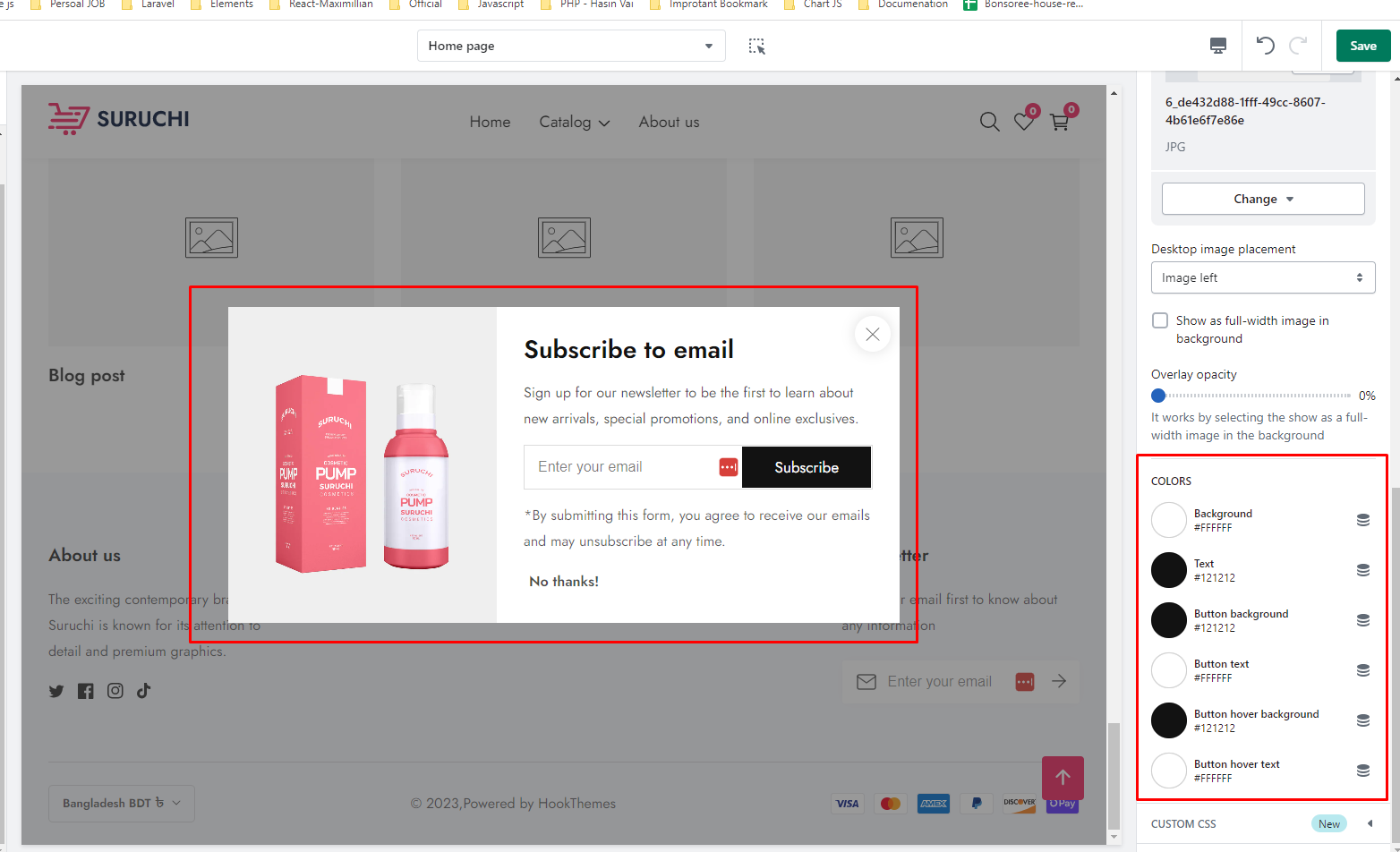
## **Popup Image Settings**
| Settings | Description |
| ------------------------------------------ | --------------------------------------------------------------------------------------------------------------------------------------------------------------------------------- |
| Desktop image | This is an image for the popup. |
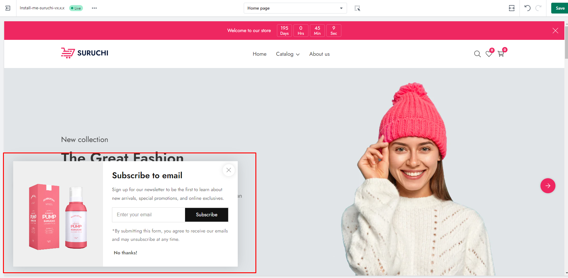
| **Desktop image placement** |
Image left: You can show the image on the left side of the popup. Image right: You can show the image on the right side of the popup.
|
| **Show as full-width image in background** | You can show it as a full-width image in the background of the popup. By default, it’s disabled. |
| **Overlay opacity** | It works by selecting the show as a full-width image in the background. You can add overlay opacity. |
## **Colors settings**
## Block settings
| Block name | Settings |
| -------------- | ---------------------------------------------------------------------------------------------------------------------------------------------------------------------------------------------------------------------------------------------------- |
| **Heading** |
You can add the heading
You can also change the heading size
|
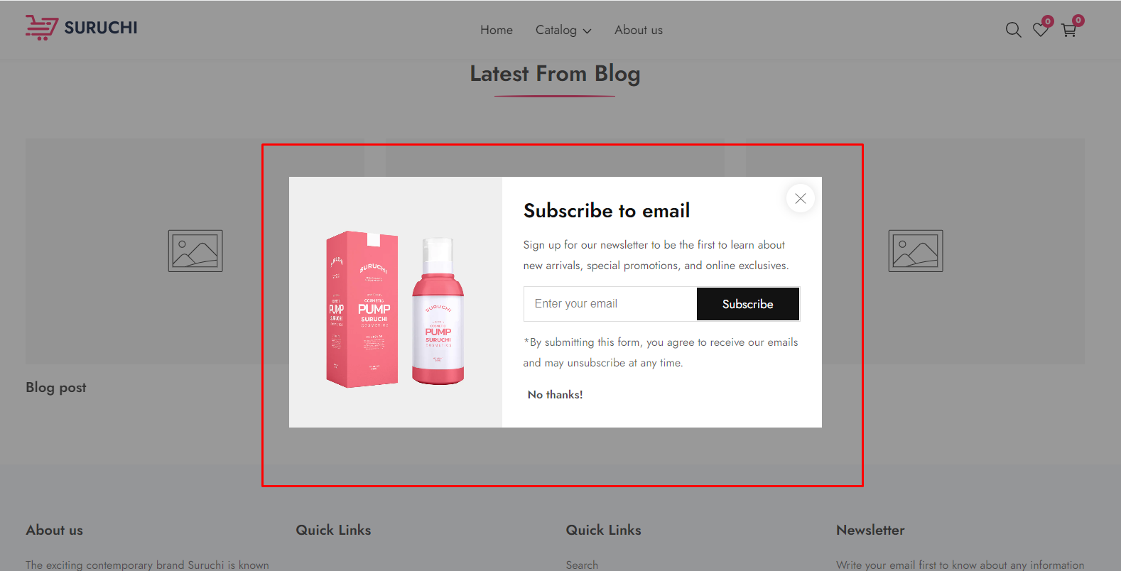
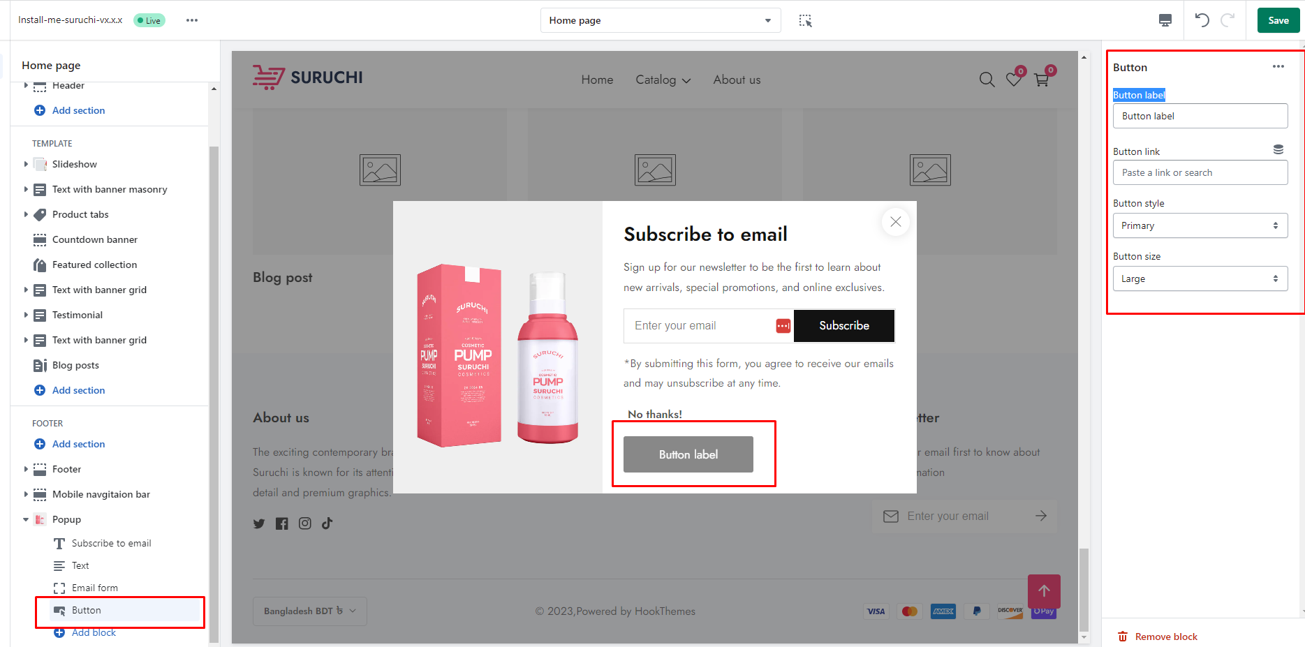
| **Text** | You can add a description in the popup |
| **Email form** |
You can add an email form
You can add a label for the email
Make button full width: If you enable it, the subscribe button will be full width