> For the complete documentation index, see [llms.txt](https://themihub.gitbook.io/isotech-shopify-theme/llms.txt). Markdown versions of documentation pages are available by appending `.md` to page URLs; this page is available as [Markdown](https://themihub.gitbook.io/isotech-shopify-theme/theme-settings/colors.md).
# Colors
How to alter the color scheme to better fit the style and feel of the website
{% hint style="success" %}
**Take the following steps:**
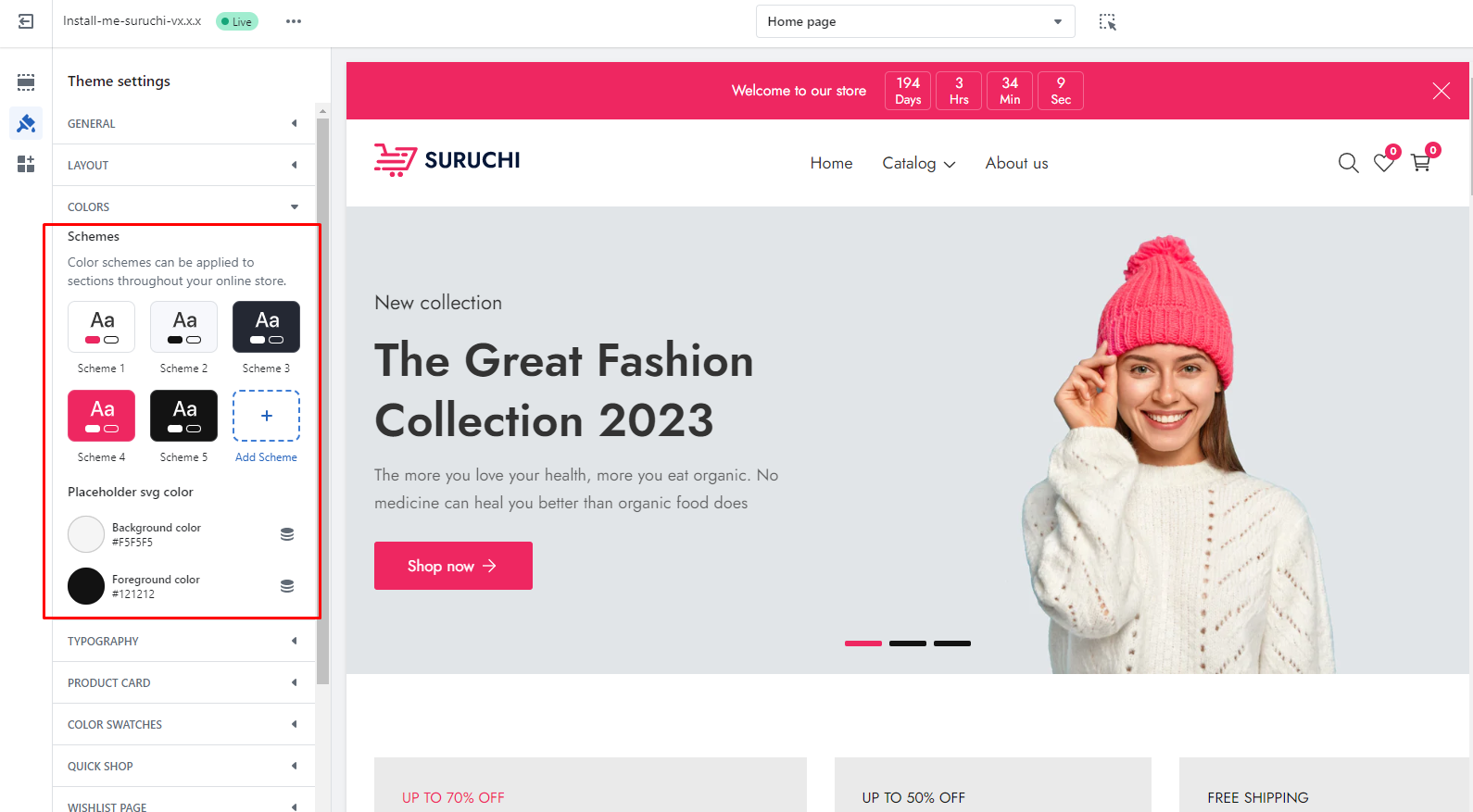
1. In the theme editor (**Customize**), click **Theme settings**
2. Locate **Color settings**
3. Make the necessary adjustments.
4. **Save**
{% endhint %}
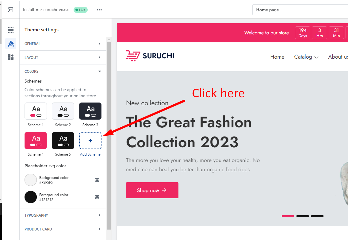
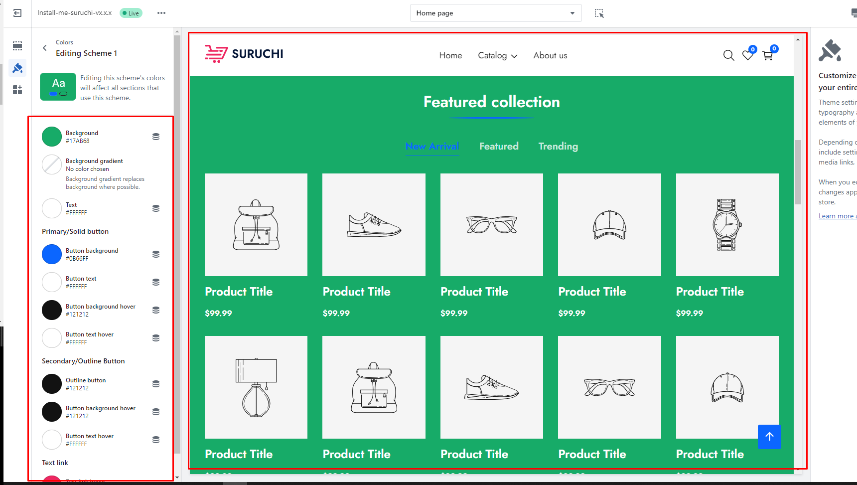
## Add a color scheme group
| Settings | Description |
| ---------------------------- | ------------------------------------------------------------------------ |
| Background | This is a field to add background color |
| Background gradient | Background gradient replaces background where possible. |
| Text | This is a field to add text color |
| **Primary/Solid button** | **Solid background button** |
| Button background | This is a field to change the **solid button** background color |
| Button text | This is a field to change the **solid button** text color |
| Button background hover | This is a field to change the **solid button** hover background color |
| Button text hover | This is a field to change the **solid button** hover text color |
| **Secondary/Outline Button** | **Outline button** |
| Outline button | This is the field to change the **outline button** text and border-color |
| Button background hover | This is a field to change the **outline button** hover background color |
| Button text hover | This is a field to change the **outline button** hover text color |
| **Text link** | |
| Text link hover | You can add a hover color to the link |
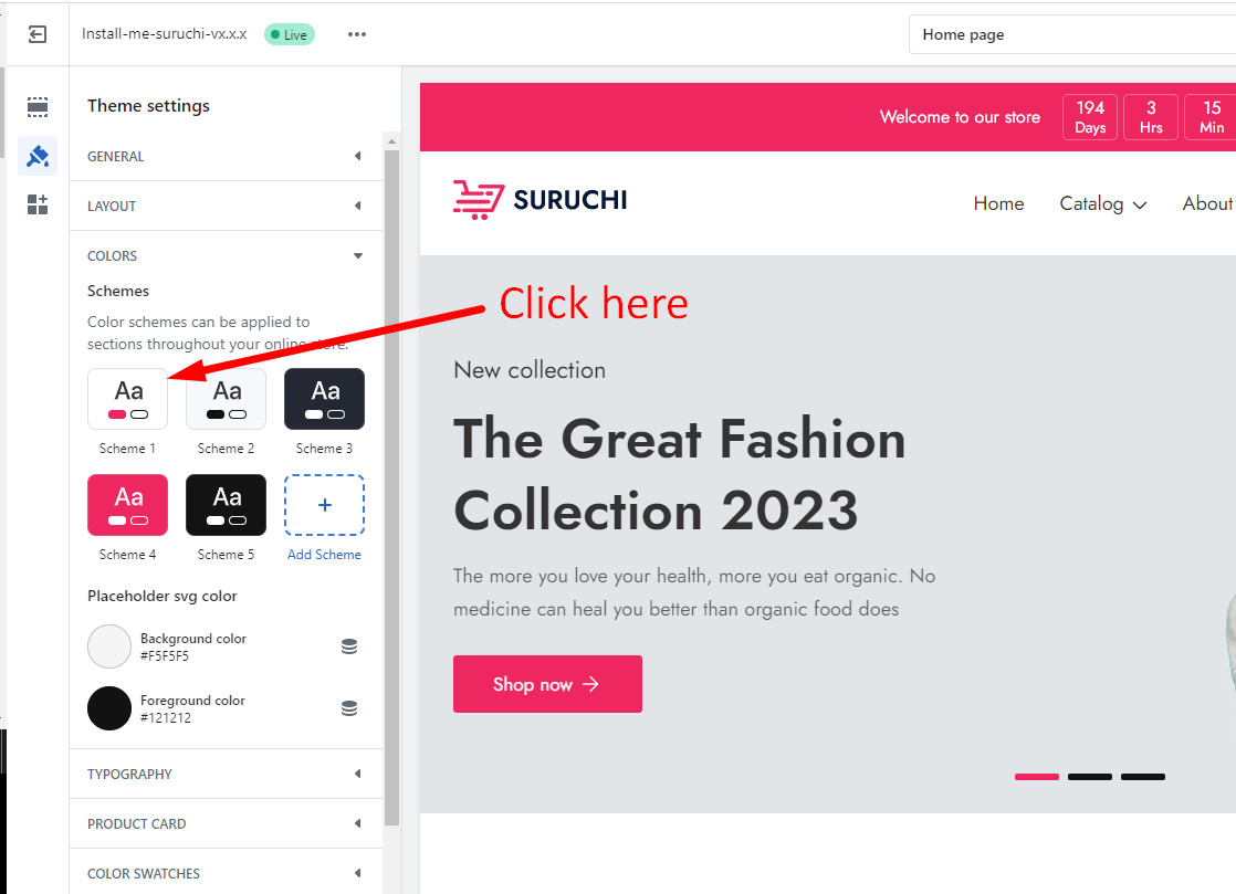
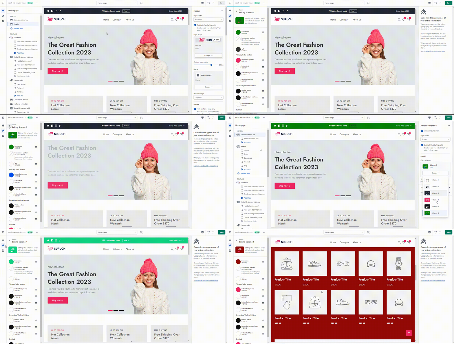
## Edit the existing color scheme group
## Change color to section
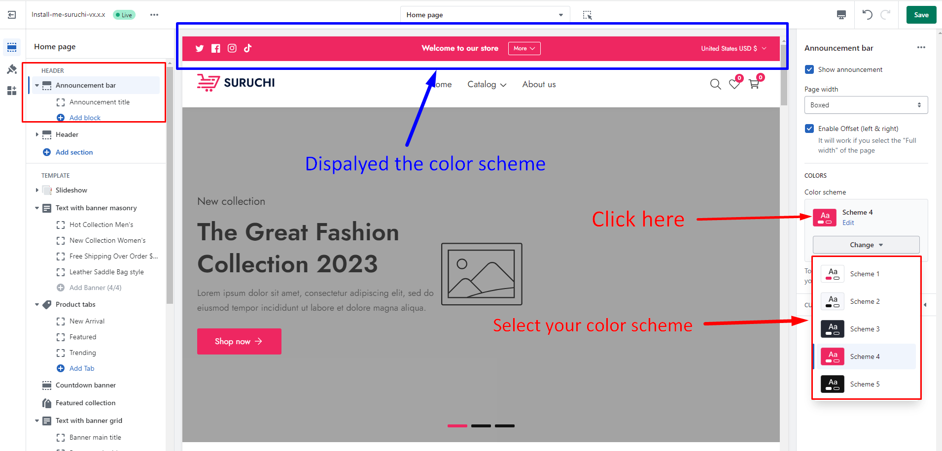
After adding the color scheme group, you can add/change the color scheme for the specific section
## Summary